Choose The Right Color Palette
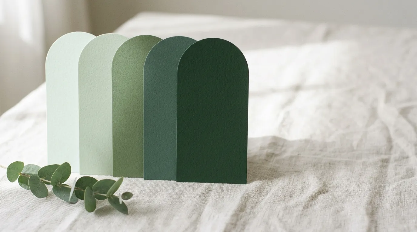
Choosing colors can feel overwhelming. Start with one shade you love, such as a favorite pillow, a piece of art or a paint chip, pick a style, and this generator builds a matching five-color palette for your walls, furniture and accents. Tap any swatch to copy its hex code.
- Pick your base color with the color picker.
- Choose a style: calm, soft, bold or playful.
- Tap Generate palette.
- Tap any swatch to copy the color code and use it for paint matching, mood boards or shopping.
- Follow the 60-30-10 rule: 60% main color (walls and rugs), 30% secondary color (sofa and curtains) and 10% accent (pillows, art and decor).
- Repeat each color at least three times in the room so the palette feels intentional.
- Test paint samples on at least two walls and check them in morning and evening light.
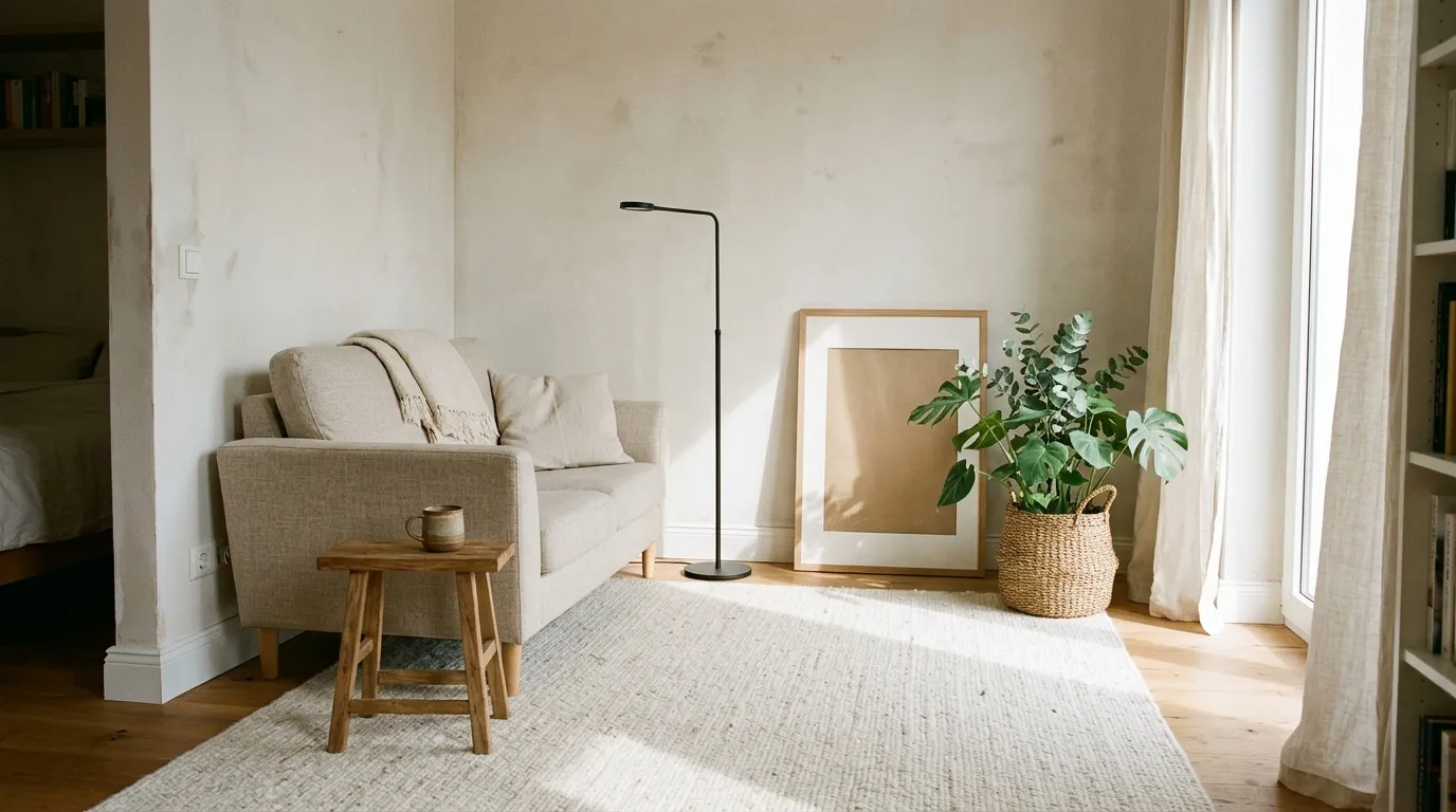
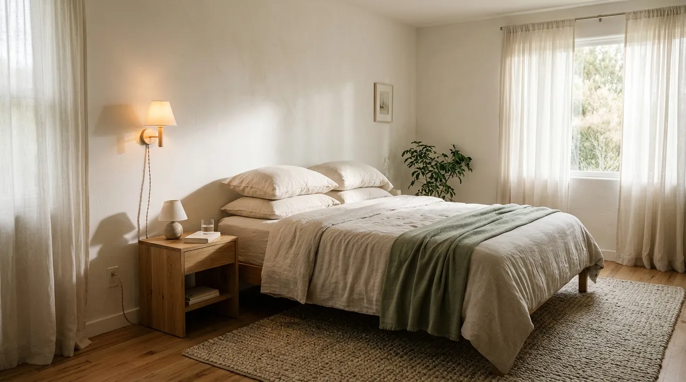
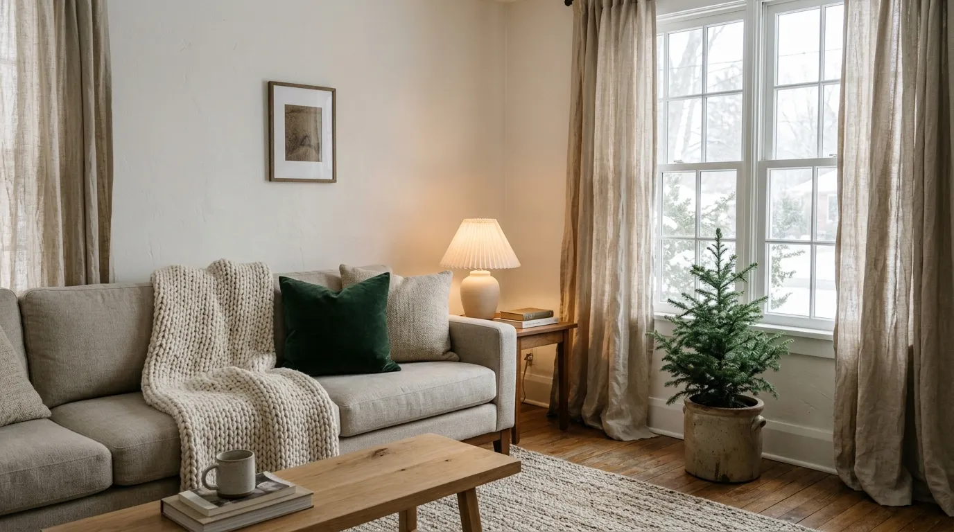
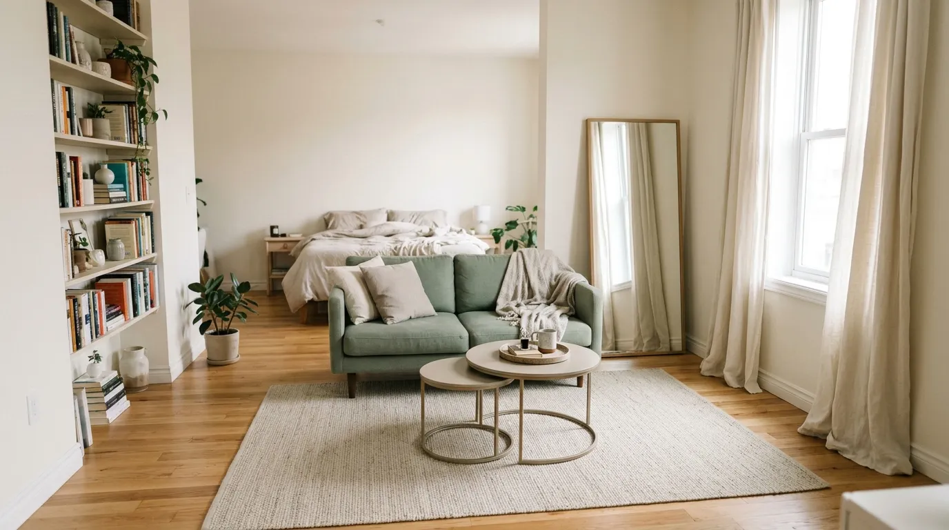
- Mix textures like linen, wood, metal and wool to make a simple palette feel rich.
- Keep one neutral in every palette to give your eyes a place to rest.
What do the four styles mean?
Calm uses shades of one color. Soft uses neighboring colors on the color wheel. Bold pairs your color with its opposite. Playful uses three colors evenly spaced around the wheel.
What colors make a small room feel bigger?
Light, warm neutrals and soft tints reflect more light and make walls feel farther away.
How many colors should I use in a room?
Three to five is plenty for most rooms, including neutrals.
How do I pick a base color?
Start with something you already love, like a rug, artwork or a favorite outfit, and match that.
Do cool or warm colors work better?
Warm colors feel cozy and work well in north-facing rooms. Cool colors feel calm and work well in sunny rooms.
Build a Room Palette You’ll Love, One Color at a Time
You found the perfect sofa. Or a rug you can’t stop looking at. Or a paint chip that makes you feel calm every time you hold it. Now comes the hard part: what goes with it?
Choosing colors is one of the most common reasons people stall on a decorating project. There are thousands of shades, every wall looks different in every light, and one wrong choice feels expensive. The good news is that you do not need a design degree. You only need one color you already love and a simple system for building around it.
That is exactly what the Home Decor Color Palette Generator above does. Pick your base color, choose a mood, and it builds a five-color palette you can use for walls, furniture and accents. In this guide you will learn how the generator works, what each style means, how to use the 60-30-10 rule, and how to turn a palette on your screen into a room that feels intentional.
How the color palette generator works
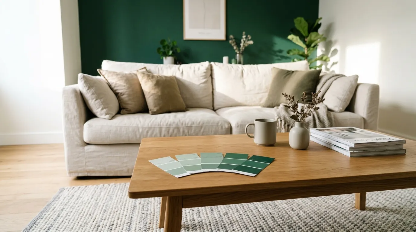
The tool takes the color you choose and breaks it into hue, saturation and lightness, the three qualities that define any color. It then moves around the color wheel according to the style you select and returns five swatches:
- A soft tint for walls, trim or a restful background.
- Two supporting colors that relate to your base.
- Your base color or a close variation of it.
- A deep shade for contrast in furniture, frames or accents.
The result is a palette with a built-in light-to-dark balance, which is the thing beginners most often miss. To use it, pick a base color, choose a style, tap Generate palette, and tap any swatch to copy its hex code. Try all four styles with the same base color. It takes seconds and shows how much the mood changes from the same starting point.
The four palette styles explained
Each style follows a classic color harmony used by interior designers. The table explains the logic, and the strips below show what each one looks like for the default deep green.
| Style | Color wheel logic | Mood | Best for |
|---|---|---|---|
| Calm (monochrome) | Different shades and tints of one color | Quiet, cohesive, spa-like | Bedrooms, bathrooms, small rooms |
| Soft (analogous) | Neighbors on the color wheel, about 30° either side of your color | Gentle, harmonious, natural | Living rooms, reading nooks, home offices |
| Bold (complementary) | Your color plus its opposite on the wheel | Energetic, high contrast, confident | Dining rooms, entryways, feature walls |
| Playful (triadic) | Three colors evenly spaced, 120° apart | Cheerful, creative, lively | Kids’ rooms, craft rooms, playrooms |
Calm (monochrome)
One hue, five steps from light to dark.
Soft (analogous)
Your green with its blue-green and yellow-green neighbors.
Bold (complementary)
Your green against its opposite, a deep berry red.
Playful (triadic)
Three evenly spaced hues: green, purple and amber.
Strips are an approximation of the generator’s output for the default base color #1D5A48.
A quick way to choose: if you want to relax in the room, go calm or soft. If you want the room to wake you up or make a statement, go bold or playful.
How to choose your base color
The base color is the most important input, and the easiest way to pick it is to start with something you already own and love. People have a better color instinct than they realize. Look for it in:
- A rug, throw or pillow you would hate to give up.
- A piece of art that makes you stop and look.
- A favorite outfit or accessory, since you choose these colors naturally.
- A nature photo such as a forest, a beach or a sunset.
- A paint chip you have been carrying around.
- Fixed features like flooring, countertops or a brick fireplace that you cannot change.
Tip: if you are working from a photo, use a color picker on a screenshot to match it as closely as possible, and photograph the item in daylight.
If you have a fixed feature, such as orange-toned wood floors, treat it as part of your palette rather than fighting it. Pick a base that sits comfortably next to it.
The 60-30-10 rule
Having a palette is only half the job. The other half is deciding how much of each color to use. The classic answer is the 60-30-10 rule.
This ratio works because it gives the eye one calm area to rest on, one area of interest and a few small moments of excitement. When all colors are used in equal amounts, a room feels busy. When one color dominates everything, it feels flat.
Making the rule work in real life
- It applies to each room, not the whole home, so every room can have its own balance.
- Think of it as a guideline. A room with a lot of wood or a patterned rug may use a looser split.
- Repeat each color at least three times in the room so it feels planned rather than accidental. If your accent is mustard, use it in a pillow, a picture frame and a candle.
Want to see the 60-30-10 split with your own color? Back to the generator ↑
Example palettes for every room
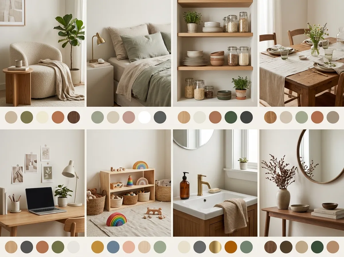
Here are starting points to try in the generator. Enter the base color, choose the suggested style and see what you get. Tap a color to copy its code, then adjust the base to match your own pieces.
| Room | Suggested base | Best style | Feeling you’ll get |
|---|---|---|---|
| Living room | Soft | Grounded, natural, welcoming | |
| Bedroom | Calm | Restful, quiet, hotel-like | |
| Kitchen | Soft or calm | Fresh, clean, friendly | |
| Dining room | Bold | Warm, social, dramatic | |
| Home office | Calm | Focused, steady, professional | |
| Kids’ room | Playful | Cheerful, energetic, creative | |
| Bathroom | Calm | Spa-like, relaxing | |
| Entryway | Bold | Memorable first impression |
Warm vs cool colors and room light
The same color looks very different depending on the light in the room. Before you commit, consider which way your windows face.
| Window direction | Light quality | Colors that work well | Watch out for |
|---|---|---|---|
| North-facing | Cool, dim, bluish | Warm colors: creams, soft yellows, terracotta, warm greige | Cool grays and blues can feel cold and flat |
| South-facing | Bright, warm, steady | Almost anything; cool colors stay fresh | Very warm yellows can feel overheated |
| East-facing | Warm and bright in the morning, cooler later | Soft greens, warm whites, light blues | Colors shift a lot through the day |
| West-facing | Soft in the morning, strong golden light in the evening | Cooler tones to balance the glow | Very warm shades can look orange at sunset |
The simple version: warm colors feel cozy and work well in north-facing rooms. Cool colors feel calm and work well in sunny rooms.
Lightbulbs matter too. Warm white bulbs (around 2700K) enrich reds, oranges and yellows, while cooler bulbs (4000K and above) make blues and grays look crisper. Choose your bulbs before you finalize paint. Our Lighting Calculator can help you pick the right brightness.
Colors for small rooms
A small room does not need to be white. It needs to feel intentional. A few approaches that work:
- Use light, warm neutrals and soft tints. They reflect more light and make walls feel farther away.
- Go tone-on-tone. A calm palette with walls, trim and curtains in close shades blurs edges and makes the room feel larger.
- Paint the ceiling a lighter shade than the walls to lift the room.
- Save your deepest shade for the 10%. A dark lamp or picture frame adds depth without crowding the space.
- Choose a dark, moody color on purpose. In a tiny powder room or den, a deep green or navy can feel cozy and dramatic instead of cramped.
Adding texture and neutrals
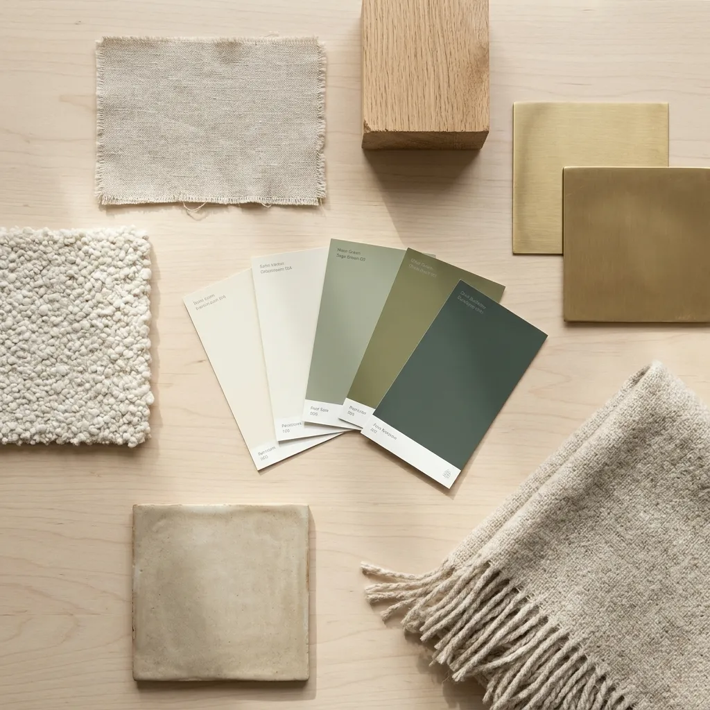
A palette of five colors can look flat if every surface is smooth and matte. This is where texture does the work.
- Linen and cotton soften hard edges and add a relaxed feel.
- Wood adds warmth and works as a neutral in almost every palette.
- Metal such as brass, black iron or brushed nickel adds shine and structure.
- Wool, boucle and velvet bring depth and richness to sofas, throws and pillows.
- Glass, ceramic and stone add reflection and variety in small decor.
Also keep one neutral in every palette: white, cream, beige, gray or black. A neutral gives your eyes a place to rest, and it makes the stronger colors feel deliberate.
Common color mistakes to avoid
- Choosing paint from a tiny chip. Colors look stronger and different across a whole wall. Always test a larger sample.
- Matching everything exactly. A perfectly matched room can look like a showroom. Aim for colors that relate, not colors that are identical.
- Ignoring undertones. A cream with a yellow undertone beside a gray with a blue undertone can clash. Compare samples side by side.
- Skipping the neutral. Without a neutral, every color competes for attention.
- Using every color once. Repeat colors around the room to create rhythm.
- Forgetting fixed elements. Floors, countertops and large furniture are part of the palette, so include them from the start.
- Painting before checking the light. Look at samples in the morning, afternoon and evening, and with the lights on.
From screen to wall: testing your palette
A hex code is a screen color. Paint is a physical color, and the two will never match perfectly. Use the generator to get direction, then confirm it in the real room.
- Generate your palette and copy the hex codes you like.
- Find the closest paint colors. Take the hex codes or a screenshot to a paint store, or use the paint brand’s color matching tool.
- Get sample pots or peel-and-stick samples for your top choices.
- Test on at least two walls, since one wall may be lit differently from another.
- Live with it for a few days in morning light, evening light and with lamps on.
- Hold fabric swatches and decor next to the sample to check how everything works together.
- Calculate how much paint you need before you buy. Our Paint Calculator makes this simple.
Quick checklist
Tick these off before you buy paint or furniture.
More questions
The common questions are answered in the tool above. Here are a few more.
Can I use the palette for furniture and not just paint?
Yes. Use the swatches as a guide for sofas, curtains, bedding, rugs and decor. Fabric and finishes will look slightly different from the screen, so request samples whenever you can.
Will the hex codes match my paint exactly?
Not exactly. Screens and paint reproduce color differently, so treat the hex code as a close starting point and confirm it with a physical sample.
Can I use a different color for every room?
Yes, but keep one color or neutral that repeats from room to room, especially in open-plan homes, so the spaces still feel connected.
Ready to start? Scroll back up, pick your favorite color and generate your first palette. Try all four styles, and keep the one that makes you feel at home. Once your colors are set, the next step is deciding where everything goes.