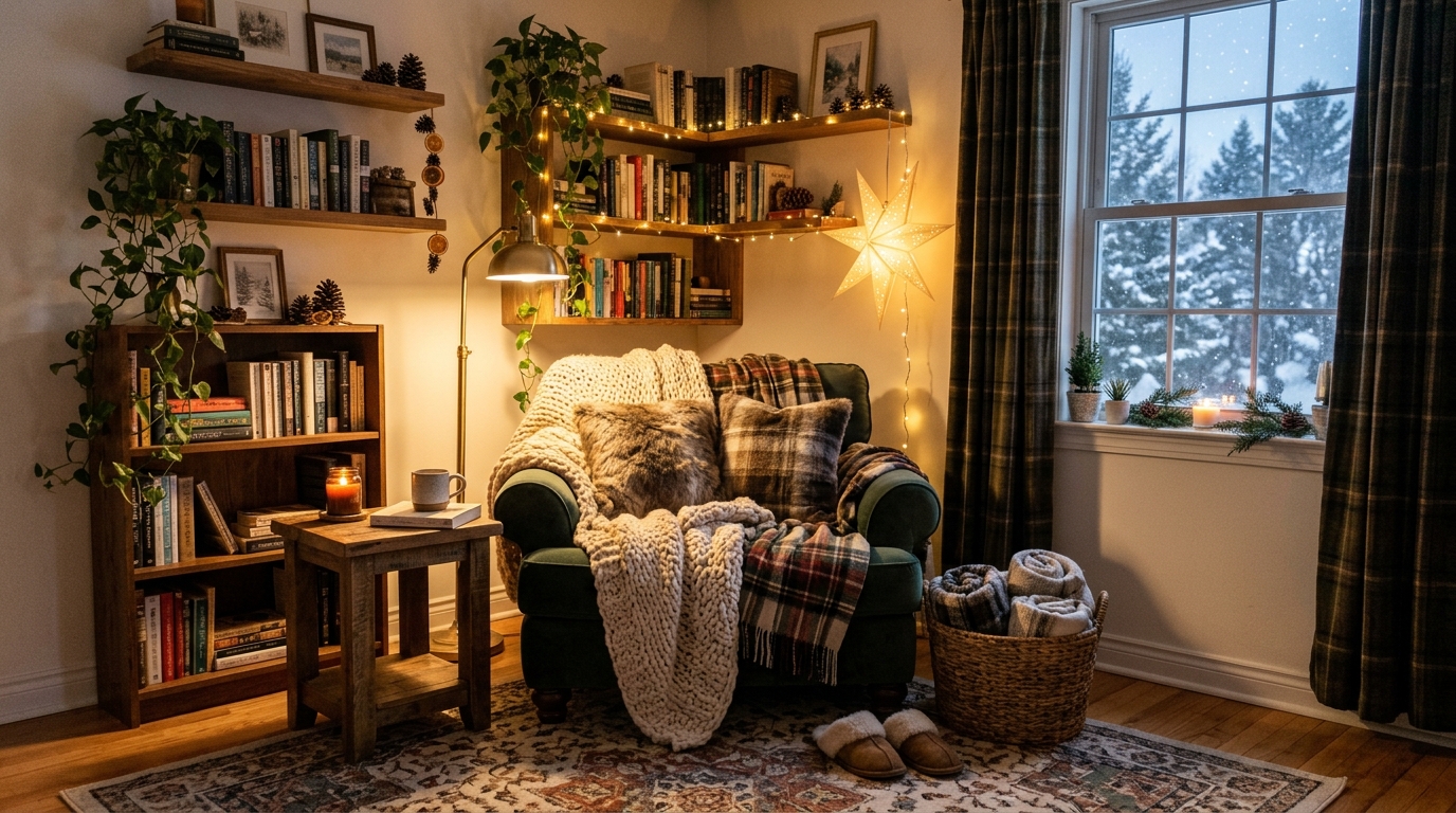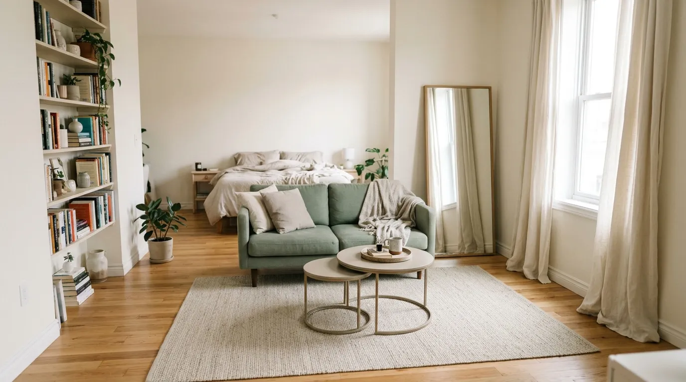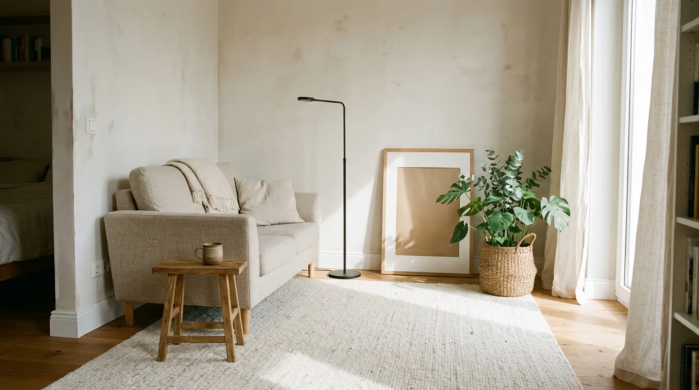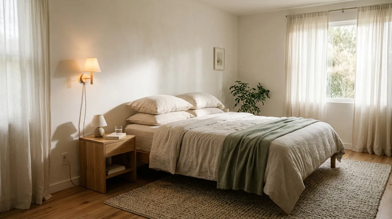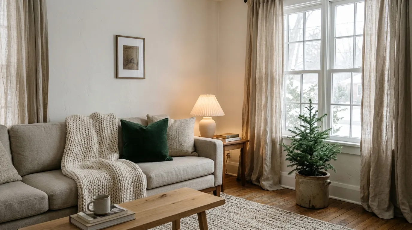

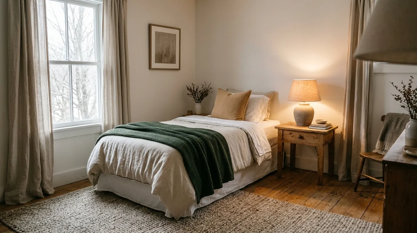
It’s the first week the heater runs all day, and your bedroom still looks like it belongs to August: pale bedding, bare windows, and a lamp that gives off a flat white glow. Good winter bedroom decor doesn’t need a new room, just warmer color and a few more layers.
What you really need is a plan that works with the bed and window you already have, in colors that feel warm instead of busy. Each look below is a mood you can build toward one piece at a time.
I’ve scaled every idea for one person and one room, and I’d start with the bedding, since it changes the whole room the fastest.
1. Oatmeal and Forest Green Calm
This look is for a bedroom that wants to feel settled and a little woodsy without turning dark. Soft oatmeal keeps things light, and one deep green does the grounding. It suits anyone who likes quiet color and tidy lines.
The Palette
- Oatmeal bedding and curtains: main
- Warm white sheets and trim: support
- Deep forest green throw and pillow: accent
The Textures
- Washed linen: a relaxed, slightly rumpled softness
- Chunky knit: a visible weave that reads warm
- Matte ceramic lamp base: a quiet, earthy finish
Key Pieces
- Oatmeal duvet cover
- Forest green knit throw
- Linen curtains in a warm neutral
- Wood nightstand
- Ceramic table lamp
Why It Works
Two light neutrals and one dark accent make an easy balance. The green anchors the bed, and the oatmeal keeps the room bright on gray days.
Keep It Balanced
Too much green can make a small room feel closed in. Keep green to the throw, one or two pillows, and a stem or two in a vase, and leave the walls and bedding light.
Renter Note
Skip the paint and bring the green in with a throw, pillow covers, and a plug-in lamp. Check your lease before painting or drilling.
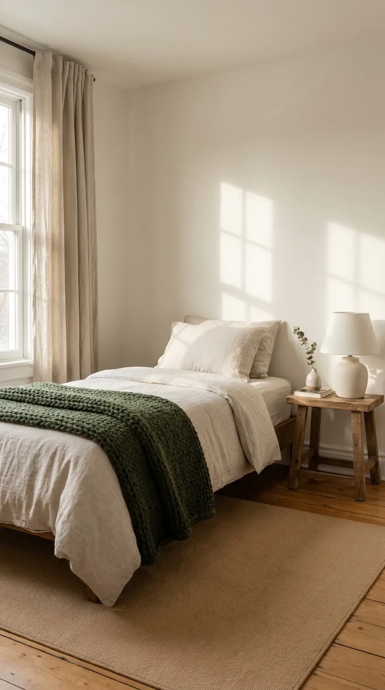
2. Soft Snow White Bedding
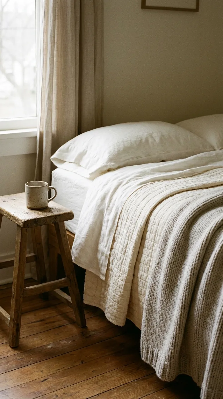
For a bedroom that feels like fresh snow without feeling cold, stack whites in different tones and weaves. It works well in small rooms and for anyone who wants the bed to be the calm center. The trick is warmth, not stark brightness.
The Palette
- Warm white sheets and pillowcases: main
- Cream quilt or coverlet: support
- Pale gray-beige throw: support
- Soft wood on the bedside stool: accent
The Textures
- Crisp cotton sheets: a clean base layer
- Quilted coverlet: dimension without bulk
- Chunky knit blanket: a warm, tactile top layer
Key Pieces
- Warm white sheet set
- Cream quilt
- Two pillow sizes in different whites
- Knit throw
- Small wooden stool as a bedside table
Why It Works
Layering whites in different shades and weaves gives the bed depth, so the room reads soft instead of flat. Warm undertones keep the whites from looking icy against a gray winter window.
Keep It Balanced
All-white can look clinical when the whites clash. Choose whites that share the same warm undertone, and add one wood or woven piece so the bed doesn’t blend into the wall. If the room still feels stark, swap one bright white pillow for cream.
3. Plum and Warm Lamp Glow
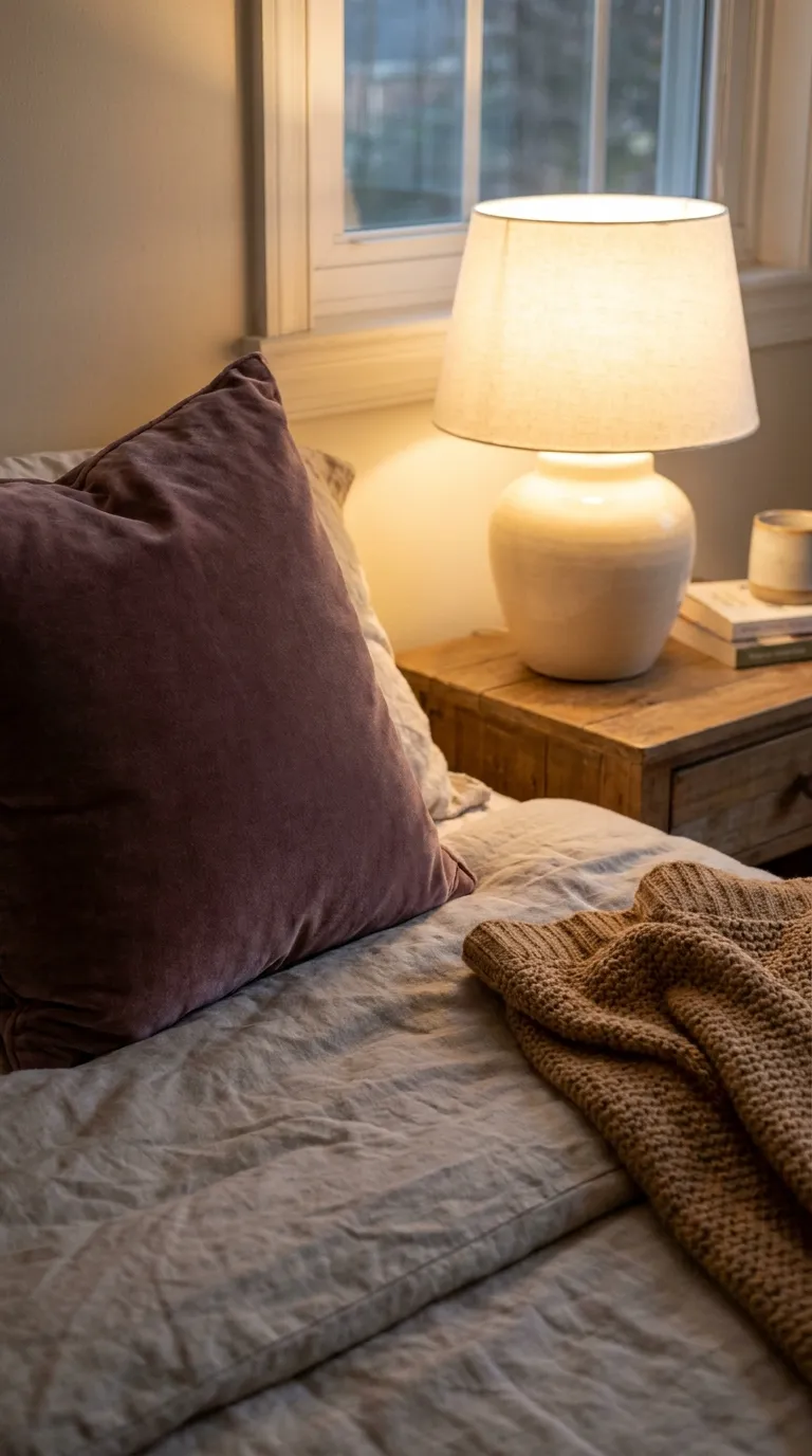
Deep plum feels rich after dark, especially with a warm lamp beside it. This is a mood for evenings: small pools of light, a velvety accent, and one color doing the dramatic work. It suits anyone who likes settling in with a book once the sun goes down.
The Palette
- Oatmeal or warm gray bedding: main
- Warm white lampshade and sheets: support
- Soft brown wood tones: support
- Muted plum pillow and throw: accent
The Textures
- Velvet-style pillow cover: absorbs light and looks rich
- Smooth ceramic lamp base: a calm contrast
- Linen lampshade: diffuses light softly
Key Pieces
- Plum pillow covers
- Table lamp with a fabric shade
- Neutral duvet cover
- Small wooden nightstand
- Folded knit blanket
Why It Works
A dark accent looks warmer when a lamp casts a soft pool of light beside it. The glow does half the work, and the plum only has to sit in it.
Keep It Balanced
Plum can feel heavy if it covers the whole bed. Keep it to the accent layer: one or two pillows and a throw, with neutral bedding underneath. Pick a warm-toned bulb so the plum reads rich instead of gray.
Renter Note
Table lamps and pillow covers bring in this look without touching the walls. Check the lamp’s label for the maximum bulb wattage before you swap in a new bulb.
4. Cinnamon and Cream Layers
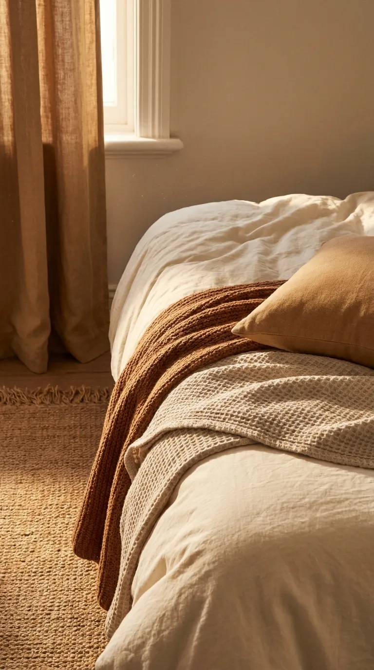
Warm spice tones and creamy neutrals make the room feel like a mug of something hot. This look layers soft browns over cream so the bed reads cozy without looking heavy. It suits anyone who wants warmth that still feels light.
The Palette
- Cream bedding and walls: main
- Soft tan or camel curtains: support
- Warm white sheets: support
- Cinnamon throw and pillow: accent
The Textures
- Flannel-style sheets: a soft, brushed surface
- Waffle-weave blanket: gentle texture on a plain base
- Woven jute rug: an earthy layer underfoot
Key Pieces
- Cream duvet cover
- Cinnamon knit throw
- Camel pillow covers
- Woven rug beside the bed
- Warm white curtains
Why It Works
Cream and cinnamon share a warm undertone, so they blend instead of competing. The layers add depth while the room stays bright.
Keep It Balanced
Too many brown tones can turn muddy. Keep cinnamon to two layers, such as a throw and a pillow, and let cream cover the biggest surfaces.
Pick a base shade and a style below to see a five-color mix you can copy.
5. Quiet Scandinavian Winter
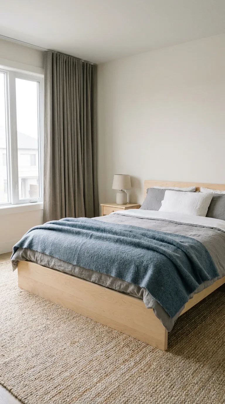
This is the pared-back option: pale woods, soft gray, and very little clutter. It suits small rooms and anyone who likes a bedroom that feels calm and easy to keep tidy. Warm textiles keep it from reading cold.
The Palette
- Soft gray and white bedding: main
- Pale birch or ash wood tones: support
- Warm gray curtains: support
- Muted dusty blue throw: accent
The Textures
- Brushed wool blanket: warmth in a muted tone
- Smooth light wood: a clean, simple surface
- Heavy cotton curtains: a soft, straight drape
Key Pieces
- Simple wood bed frame
- Gray duvet cover
- Wool-blend blanket
- Single pendant or table lamp
- Woven or wool rug
Why It Works
Few colors and plenty of texture let the room feel quiet without feeling empty. Pale wood and soft gray also make the most of weak winter daylight.
Keep It Balanced
Minimal can slide into cold. Add at least two warm textiles, like a wool blanket and heavy curtains, so the room doesn’t feel bare. A warm-toned bulb helps too.
6. Charcoal and Camel Retreat
Charcoal gives the room depth, and camel keeps it from feeling stern. The result is a tailored bedroom that feels grown-up without being gloomy. It suits anyone who prefers deeper colors over soft ones.
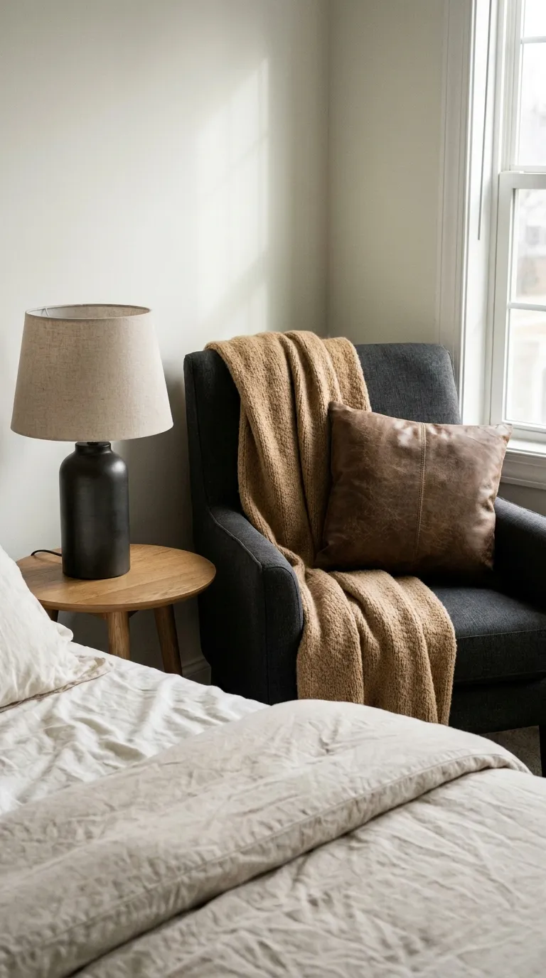
The Palette
- Charcoal headboard or armchair: main
- Warm white sheets: support
- Dark metal lamp: support
- Camel throw and pillows: accent
The Textures
- Wool-blend upholstery: a dense, tailored feel
- Leather-look pillow cover: a subtle sheen
- Matte metal: a clean, dark finish
Key Pieces
- Charcoal upholstered headboard or armchair
- Camel throw
- Warm white bedding
- Small side table
- Dark metal table lamp
Why It Works
Dark and warm neutrals feel grounded together. Camel picks up the warmth of lamplight and stops the charcoal from looking flat.
Keep It Balanced
Charcoal can swallow a small room. Use it on one large piece and keep the walls and bedding light. When you plan your furniture layout, leave a clear path around the bed so the dark pieces don’t crowd it.
Renter Note
If you can’t change the headboard, use a charcoal throw or a freestanding armchair instead. If you hang anything on the wall, check your lease and use hooks within their stated weight limit.
7. Blush and Cocoa Textures
Blush softens a winter bedroom without turning it sweet, especially when cocoa brown does the grounding. This look is about touch: plush, knitted, and brushed surfaces in muted tones. It suits anyone who wants a gentle room that still feels grown-up.
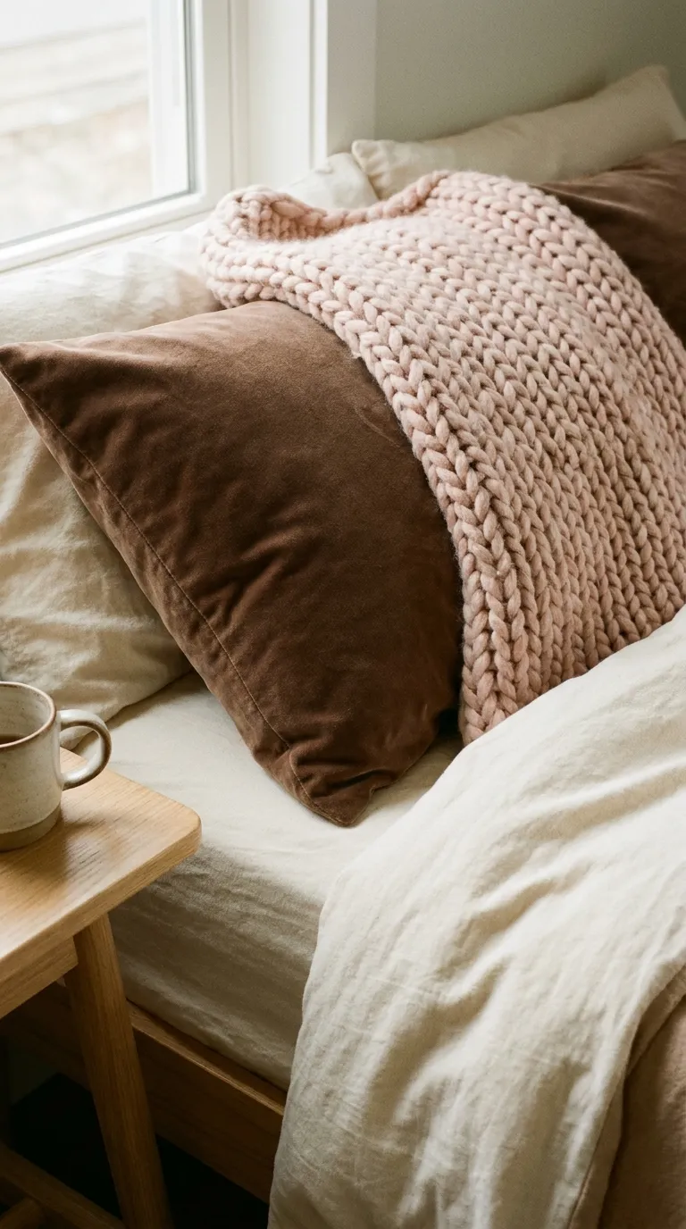
The Palette
- Cream or warm white bedding: main
- Muted blush throw and pillowcases: support
- Light wood bedside table: support
- Cocoa brown pillow or blanket: accent
The Textures
- Chunky knit in blush: a soft, visible weave
- Velvet-style cocoa pillow: a dense, plush surface
- Brushed cotton sheets: a gentle, matte finish
Key Pieces
- Blush knit throw
- Cocoa pillow covers
- Cream duvet cover
- Linen-blend pillowcases
- Small wood side table
Why It Works
Cocoa gives blush a grounded partner, so the pink reads soft instead of sweet. The mix of knit and velvet keeps the eye moving across the bed.
Keep It Balanced
Too much blush can feel sugary. Keep blush to the throw and pillowcases, and let cream and cocoa carry the rest. If it still leans too pink, trade one blush piece for oatmeal.
Try it: tap each piece to decide whether it plays the main, support, or accent role in its room.
8. Navy and Brass Night
Deep navy feels like a clear winter evening, and a touch of brass adds a warm glint. It’s a tidy, restful mood that works well in a bedroom with little direct light. It suits anyone who likes a more formal finish.
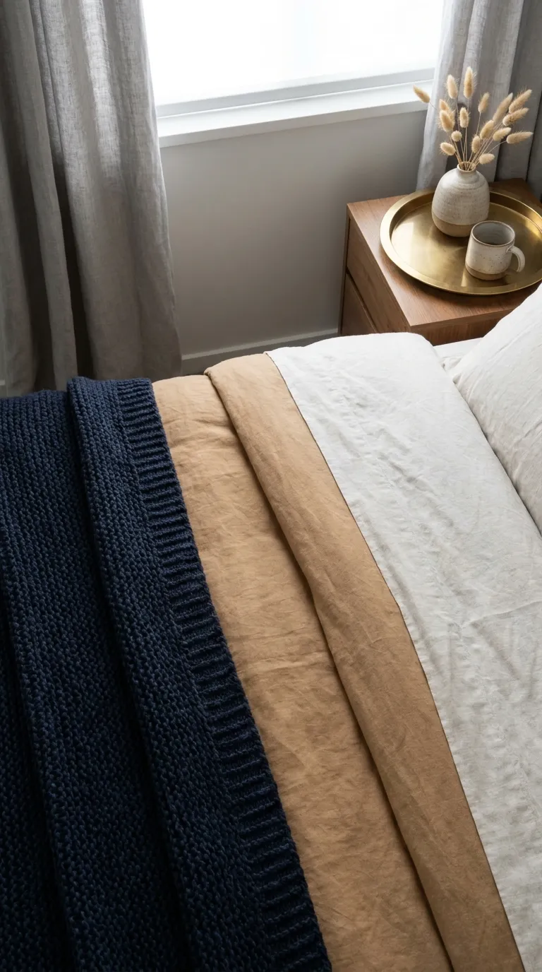
The Palette
- Warm white bedding: main
- Deep navy throw and pillows: support
- Soft gray curtains: support
- Brass lamp base or tray: accent
The Textures
- Velvet-style navy pillow: a deep, rich finish
- Brushed brass: a warm, soft shine
- Crisp cotton sheets: a clean contrast
Key Pieces
- Navy knit or woven throw
- Warm white duvet cover
- Brass-finish table lamp
- Small tray for the nightstand
- Soft gray curtains
Why It Works
Navy reads as a rich neutral, and brass picks up lamplight to add warmth. The contrast keeps the room crisp and cozy at once.
Keep It Balanced
Navy and brass can look stiff together. Keep metal to one or two pieces, and add a soft knit so the room feels lived in. If the room feels too dark, bring in one more warm white layer.
9. Rust and Sage Cabin Mood
Rust and sage give a bedroom a cabin feeling without any log walls. Earthy red-brown warms the bed, and muted green keeps it calm. This look suits anyone who loves natural colors and a slightly rustic edge.
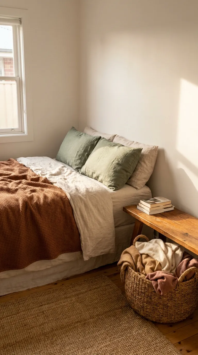
The Palette
- Oatmeal or cream bedding: main
- Muted sage pillows and curtains: support
- Warm white sheets: support
- Rust throw and a single pillow: accent
The Textures
- Waffle knit throw: an earthy, textured weave
- Woven basket: handmade character for spare blankets
- Linen pillow covers: relaxed, matte color
Key Pieces
- Rust knit throw
- Sage linen pillow covers
- Oatmeal duvet cover
- Woven basket for extra blankets
- Wood bench or stool
Why It Works
Rust and sage sit opposite each other in tone, so each one makes the other look richer. Natural textures keep the pair feeling relaxed.
Keep It Balanced
Rust can read loud next to sage. Pick one as the lead and keep the other to one or two small pieces. Put plenty of neutral bedding between them.
Renter Note
A throw, pillow covers, and a basket make this look easy to move and easy to put away. Use no-drill options, and check your lease before painting or hanging anything.
10. Mist Gray and Warm Wood
Soft mist gray and honey-toned wood make a bedroom that feels quiet and natural at the same time. This look relies on texture and light more than color. It suits anyone who wants a calm base that works with almost any accent.
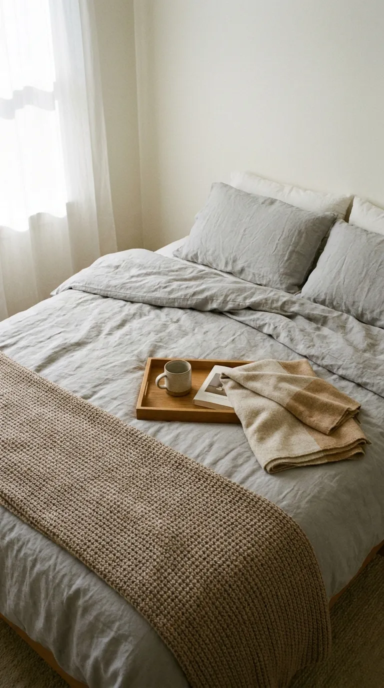
The Palette
- Mist gray duvet and sheets: main
- Warm white pillowcases: support
- Honey or oak wood tones: support
- Warm taupe throw: accent
The Textures
- Brushed cotton: a soft, matte surface
- Visible wood grain: natural warmth against gray
- Wool-blend blanket: a dense, cozy top layer
Key Pieces
- Mist gray duvet cover
- Warm taupe throw
- Oak or walnut nightstand
- Wood tray for the bed or nightstand
- Linen curtains in warm white
Why It Works
Gray looks warmer next to wood, and wood adds a natural lift to cool winter light. The combination stays calm without feeling plain.
Keep It Balanced
Gray with cool-toned wood can feel flat. Choose wood with a honey or warm brown tone, and add a warm white layer so the gray stays soft.
Quick Mood Cheat Sheet
Use this table to compare the ten moods at a glance and pick the one that fits your room’s light.
| Mood | Palette | Key Texture |
|---|---|---|
| Oatmeal and Forest Green Calm | Oatmeal, warm white, forest green | Washed linen |
| Soft Snow White Bedding | Warm white, cream, gray-beige | Quilted coverlet |
| Plum and Warm Lamp Glow | Oatmeal, plum, soft brown | Velvet-style pillow |
| Cinnamon and Cream Layers | Cream, camel, cinnamon | Waffle-weave blanket |
| Quiet Scandinavian Winter | Soft gray, pale wood, dusty blue | Brushed wool |
| Charcoal and Camel Retreat | Charcoal, warm white, camel | Wool-blend upholstery |
| Blush and Cocoa Textures | Cream, blush, cocoa | Chunky knit |
| Navy and Brass Night | Warm white, navy, brass | Velvet-style pillow |
| Rust and Sage Cabin Mood | Oatmeal, sage, rust | Waffle knit |
| Mist Gray and Warm Wood | Mist gray, warm white, honey wood | Brushed cotton |
How to Build Your Own Winter Bedroom Palette
Choosing One Main Color for Winter Bedroom Decor
Start with the biggest surface you can’t easily change, such as the walls, the bed, or the curtains, and pick your main color from it. Make that color warm: oatmeal, cream, soft gray, or warm white. Every other color then supports it.
The 60-30-10 Split
A common design guideline suggests about 60% main color, 30% support color, and 10% accent. Treat it as a starting point, not a rule. When you plan a color palette for a bedroom, the bedding, curtains, and walls usually take the 60, larger textiles like a rug or blanket take the 30, and pillows or a throw take the 10.
Repeating Colors Across the Room
Repeat each color in at least two places so the room looks planned instead of random. Echo your accent in a second spot, like a pillow on the bed and a stem in a vase across the room.
Using Natural Light and Wood Tones to Warm a Palette
Winter daylight is often gray and cool, so wood tones and warm whites do extra work. Choose wood with a honey or warm brown tone to soften cool grays and blues, and keep curtains light enough to let daylight in.
Testing Colors at Different Times of Day
Hold a fabric sample or pillow near the bed in the morning, in the afternoon, and under your lamps at night. A color that looks warm at noon can turn gray after dark. Judge the final choice in the light you use most.
Palette Mistakes Worth Skipping
Too Many Accent Colors
It’s easy to fall for three accents at once. Choose one accent and repeat it, and save the others for another season.
Ignoring Undertones
A cream with a yellow undertone next to a gray with a blue undertone can look off. Hold fabrics together in daylight before you commit, and pair warm with warm and cool with cool.
Matching Everything Exactly
Perfectly matched sets can look flat. Let shades differ slightly, as long as they share the same undertone.
Final Tips for Success
Start With the Bedding
Bedding is the biggest surface in the room, so changing it shifts the mood fastest. Swap the duvet cover before you buy anything else.
Add Light at Two Heights
A table lamp plus a second source, like a floor lamp or a plug-in sconce, makes the room feel layered after dark. Use warm-toned bulbs, and check each fixture’s label for the maximum wattage.
Check Your Lease Before You Change Anything
Paint, drilling, and wall hooks can all matter in a rental. Read your lease first, and lean on throws, pillow covers, and lamps for the look.
Basics Worth Owning
- Two duvet covers in different neutrals
- A knit or wool throw
- Two or three pillow covers in one accent color
- Warm-toned bulbs
- Heavy curtains
Conclusion
You don’t need to change everything to get winter bedroom decor that feels warm. One oatmeal duvet, one deep accent, and a lamp with a warm bulb can shift the mood of the whole room.
Pick the mood from this list that matches the light in your room, and start with the bedding. The rest can follow slowly, one layer at a time.
Whichever look you choose, keep to one main color, one support color, and one accent, and give every piece a clear role.
Save this guide for the next time you rearrange the room, and come back to it when the days get short again.