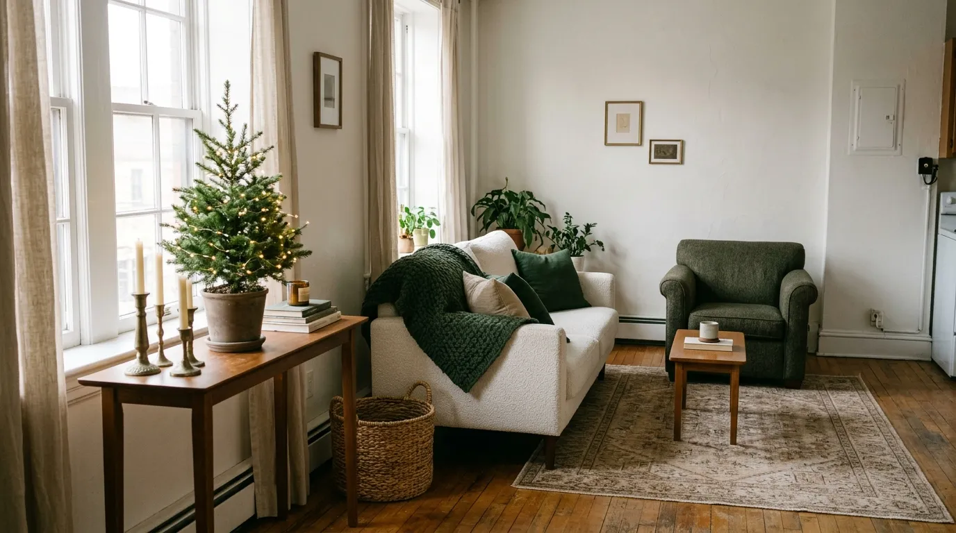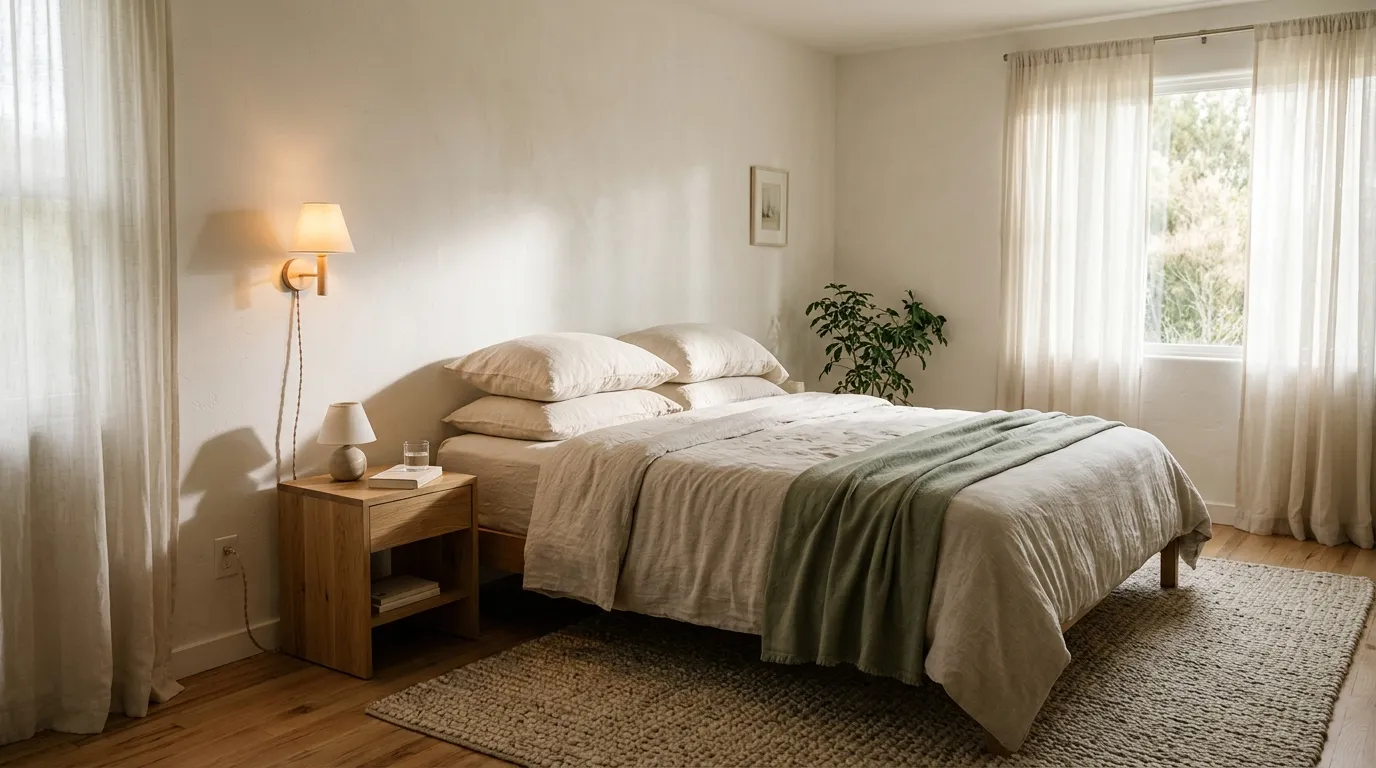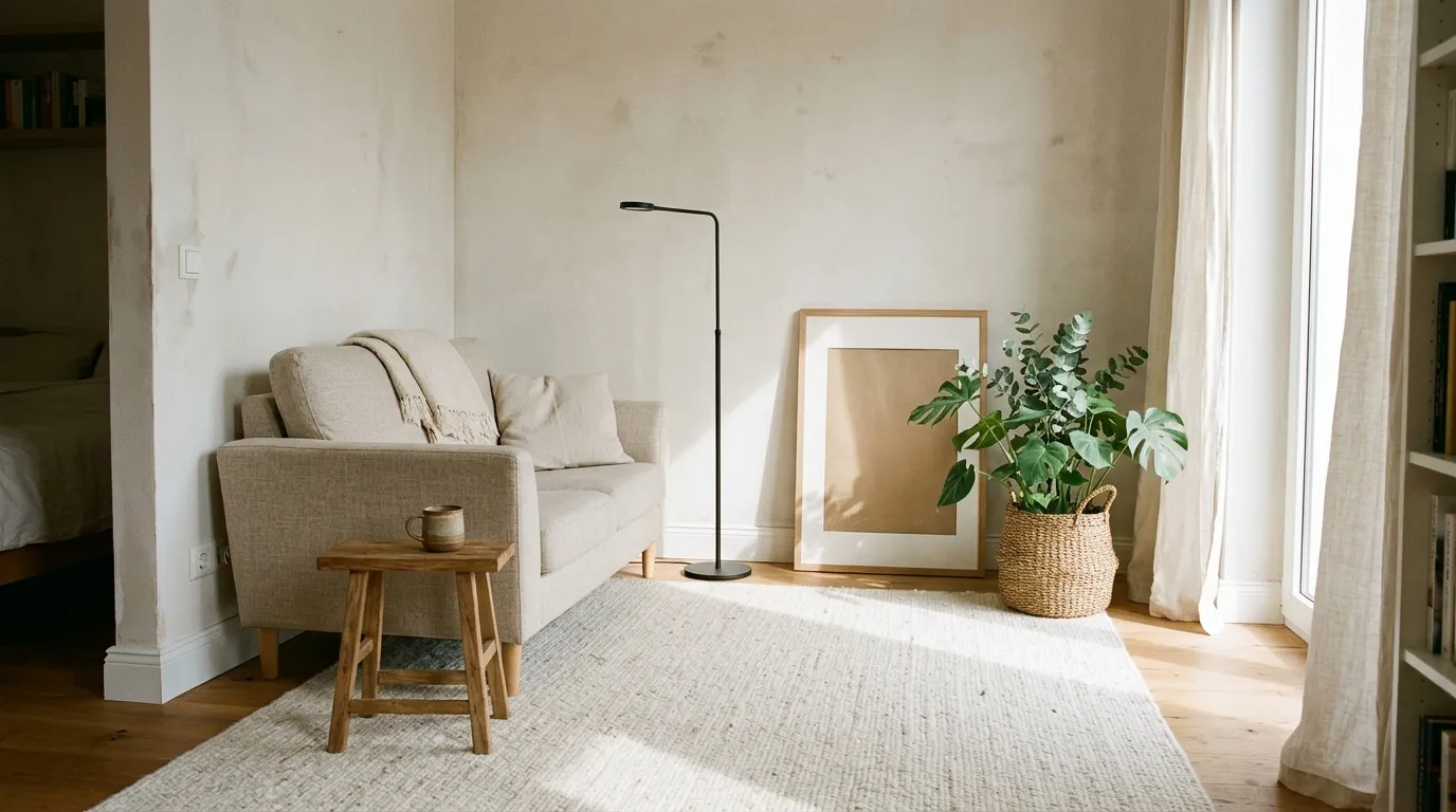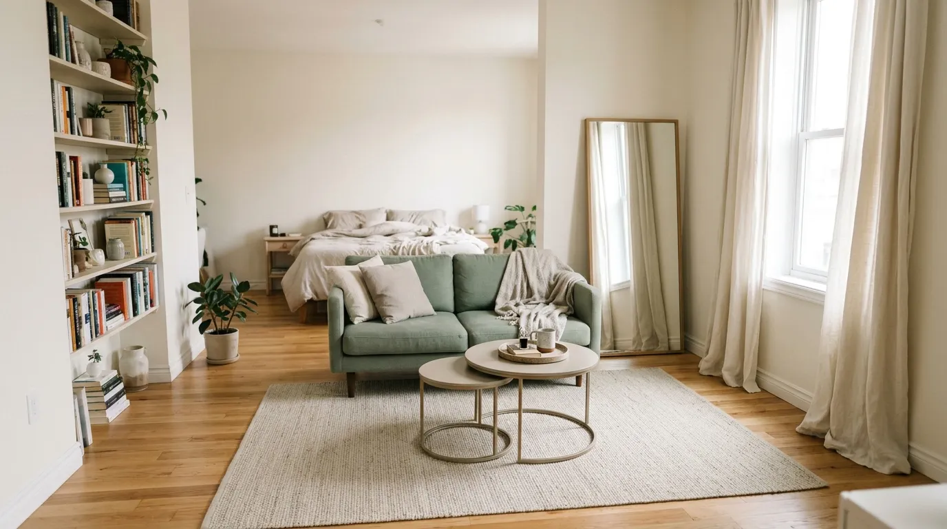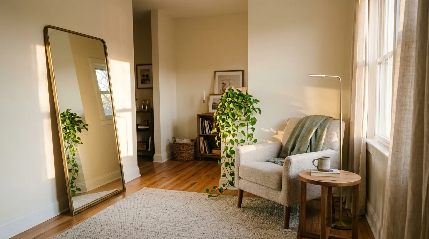

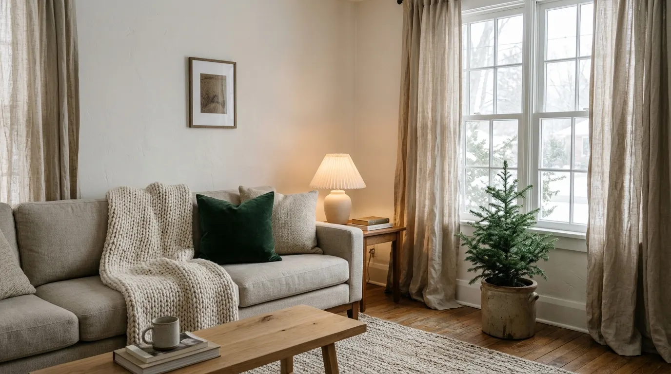
The first dark evening of the season shows you what your rental is missing. The walls are bare, the light turns flat and cold, and you can’t repaint or drill your way out of it. That’s where renter winter decor comes in: small, removable changes that make a room feel warm again.
You don’t need a big budget or a landlord’s permission to get there. You need a clear mood, a short list of colors, and a few textures that do the heavy lifting. Everything below is built for one person in one space, and every idea is reversible.
I’ve pulled together 12 winter moods, each with a palette, textures, and key pieces you can copy this weekend. I’d start with the one that already matches what’s in your closet.
1. Soft Oatmeal and Warm White
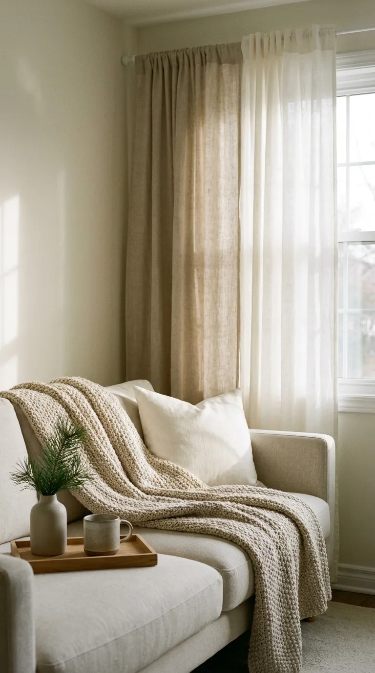
This is the quietest winter look: a room wrapped in soft neutrals that catch every bit of low daylight. It suits small rentals with beige or off-white walls, because it works with the walls instead of fighting them, and it never feels cold.
The Palette
- Main: warm white on bedding, pillow covers, and curtains
- Support: oatmeal on a throw and a rug
- Accent: deep pine green in one small plant or a single branch
The Textures
- Brushed cotton or flannel bedding adds softness you can feel right away
- A chunky knit throw adds visual weight to a flat sofa
- Linen curtains let in diffused light without hiding the window
- Matte ceramic keeps the look quiet instead of shiny
Key Pieces
- Oversized knit throw
- Two or three textured pillow covers
- Washable area rug
- Sheer or linen curtains on a tension rod
- Plug-in lamp with a warm bulb
Why It Works
Low-contrast colors make a small room feel calm and unbroken, while layered textures keep it from looking flat. The warmth comes from fabric, not from paint.
Keep It Balanced
Too much beige can make a room look washed out. Add one darker anchor, like a wood tray or a green plant, so your eye has somewhere to land.
Renter Note
Hang lightweight curtains from a tension rod, or use adhesive hooks within their stated weight limit, and check your lease before putting anything on the walls.
2. Deep Evergreen Corner
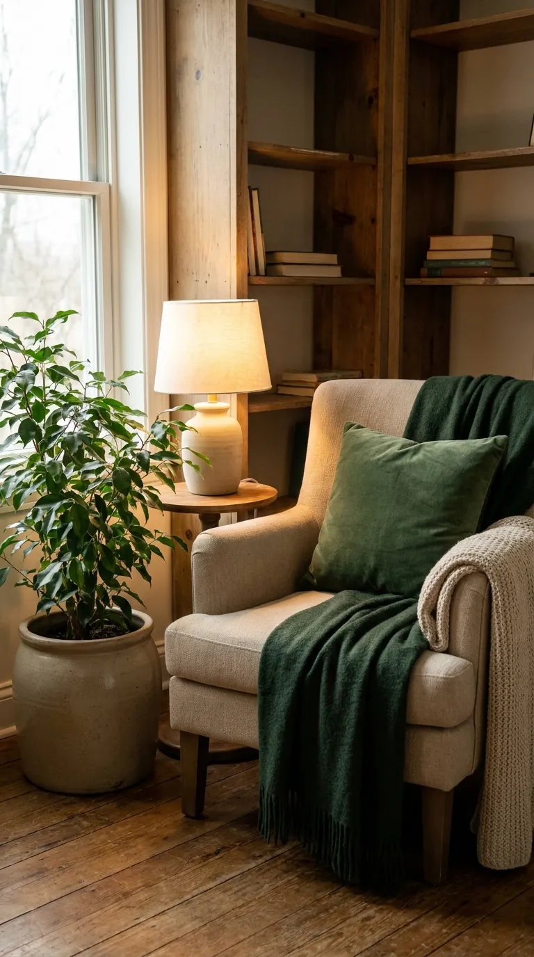
Dark green is the winter color that never feels forced. Built in one corner, it gives a rental a focal point without touching a single wall. It suits anyone with a spare armchair, a bookshelf, or a bare corner near a window.
The Palette
- Main: deep pine green on a throw and one large pillow
- Support: warm white on a lampshade and a mug
- Support: oatmeal on a knit blanket
- Accent: warm oak on a small side table
The Textures
- Velvet-feel pillow covers add depth in low light
- A wool throw adds warmth and weight
- Matte stoneware keeps the corner grounded
Key Pieces
- Armchair or floor cushion as the anchor
- Green throw and pillow covers
- Real or faux plant in a heavy pot (check that a plant is safe for pets before buying, if that applies to you)
- Plug-in table or floor lamp
Why It Works
A saturated color in one defined spot reads as intentional, not heavy. The lamp adds a warm pool of light that makes the corner feel like a place to sit.
Keep It Balanced
Deep green can swallow a small room fast. Keep it to one corner and balance it with light fabrics nearby, like a warm white pillow or an oatmeal throw.
Renter Note
Use a floor plant stand or a freestanding lamp instead of wall mounts, and keep all the color on pieces you can move.
3. Candlelit Amber Glow
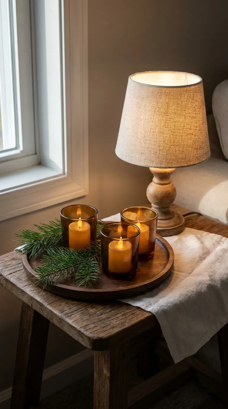
Winter evenings are long, and lighting does more than any paint color. This mood is built from warm bulbs and soft light sources at different heights, so the room glows instead of glaring. It suits studios and bedrooms that rely on one harsh overhead light.
The Palette
- Main: warm white fabrics as the base
- Support: amber and honey tones in glass and lampshades
- Accent: deep pine green in a single branch or plant
The Textures
- Ribbed or hammered glass catches and scatters the light
- Linen lampshades soften the glow
- Matte ceramic holders keep the table from looking too shiny
Key Pieces
- Two or three plug-in lamps at different heights
- Warm-toned bulbs in a soft, warm white
- Flameless candles in a group of three
- A small tray to keep the cluster tidy
- String lights draped on a shelf or curtain rod
Why It Works
Light at several heights spreads the glow and softens the hard shadows an overhead fixture creates. Warm tones also make every other color in the room look richer.
Keep It Balanced
Too many light sources can look cluttered. Stick to three layers: one tall lamp, one low lamp, and a small cluster of candles.
Renter Note
Choose flameless candles and plug-in lamps, and follow the product’s instructions for any string lights. Skip open flames near fabric.
4. Chunky Knit and Wool Layers
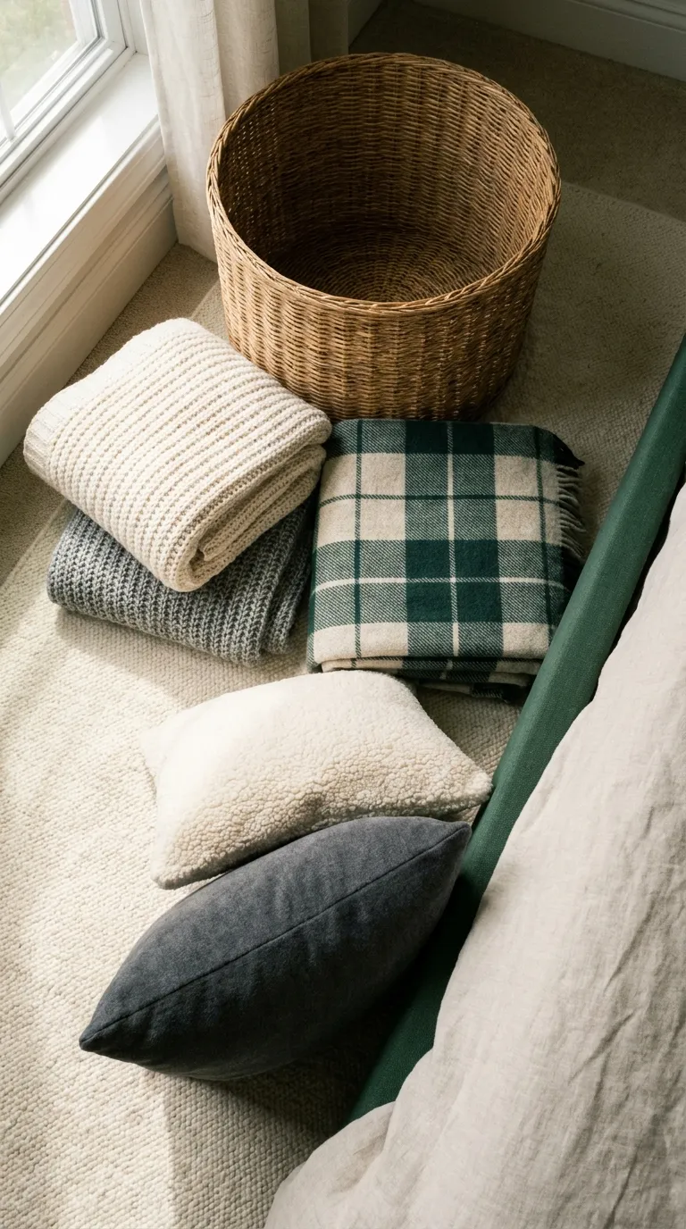
This mood is all about fabric. Instead of changing colors, you pile on texture in one calm family of shades, so the room feels warm the moment you walk in. It suits bedrooms and sofas that look flat and need something soft, fast.
The Palette
- Main: warm cream on the biggest blanket and the rug
- Support: heather gray on a second throw and pillow covers
- Accent: soft charcoal on one cushion
The Textures
- Chunky knit adds the thick, handmade look this mood is known for
- A wool blanket gives real warmth at the foot of the bed
- Sherpa-style fleece adds a fuzzy contrast to smooth cotton
- A woven basket keeps the layers tidy and adds a natural, dry texture
Key Pieces
- Oversized knit throw
- Wool or wool-blend blanket
- Two pillow covers in different knits
- Large basket for blanket storage
- Washable rug
Why It Works
Layering textures inside one color family gives the room depth without adding clutter. Fabric is also the easiest thing to swap, so you can change the look with the weather.
Keep It Balanced
Too many heavy textiles can make a small room feel crowded. Pick three textures per zone, such as one knit, one wool, and one smooth cotton, and fold the rest into the basket. Check the care label before washing anything knit or wool.
Renter Note
Layer over what you already own. Nothing in this look needs to be mounted, drilled, or painted.
5. Quiet Scandinavian Winter
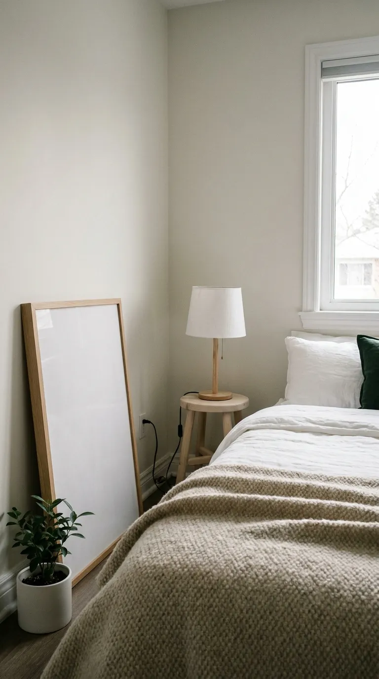
This look leans on simple shapes, pale wood, and plenty of white, then adds winter warmth through wool and a few well-placed lights. It suits small rentals that already have light floors or white walls and need a calm, uncluttered feel.
The Palette
- Main: warm white on walls, bedding, and curtains
- Support: light gray and pale oak on furniture and frames
- Accent: muted pine green on a single plant
The Textures
- A wool throw adds softness to clean, simple lines
- Linen curtains and bedding give a relaxed, slightly crinkled look
- Light wood grain adds warmth without adding color
- Matte white ceramic keeps surfaces calm
Key Pieces
- Pale wood stool or small side table
- Leaning blank frame or abstract art with soft shapes
- Linen curtains
- Wool blanket
- Plug-in lamp with a white shade
Why It Works
A common design guideline is the 60-30-10 split: about 60% main color, 30% support color, and 10% accent. Here, white covers most of the room, pale wood and gray fill the middle, and one green accent finishes it. That is why the room feels settled instead of busy.
Enter one base shade and pick a style to see a matching set of five shades you can copy.
Keep It Balanced
Too much white and pale wood can feel sterile in winter. Add one wool layer and a warm bulb to take the chill off.
Renter Note
Lean art on a shelf, a dresser, or the floor instead of using nails, and check your lease before using any wall fixings.
6. Cranberry and Cream Accents
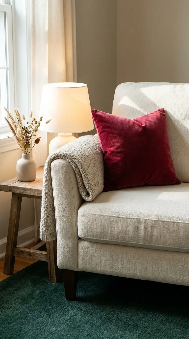
Red is the easiest way to make winter feel festive without a tree. Kept to small accents against cream, cranberry adds warmth and energy. It suits anyone who wants some seasonal color but nothing permanent.
The Palette
- Main: cream on the chair, bedding, and rug
- Support: warm white on a vase and a lampshade
- Accent: cranberry on one or two soft pieces
The Textures
- Velvet-feel pillow covers make cranberry look richer
- A wool throw keeps the cream from looking flat
- Matte ceramic and clear glass add quiet contrast
Key Pieces
- One or two cranberry pillow covers
- Cranberry throw, folded over the chair arm
- Small vase with dried or faux stems
- Cream bedding or a cream blanket
- Ceramic bowl for small items
Why It Works
Cranberry is a deep red that reads richer and softer than a bright red, and cream keeps it from feeling loud. The contrast gives a small corner a clear focal point.
Keep It Balanced
Too much red can feel loud and tiring. Keep cranberry to two or three small pieces and repeat the cream around them.
Renter Note
Change only soft pieces like pillow covers and throws, then store them away when the season ends. Nothing needs to touch the walls.
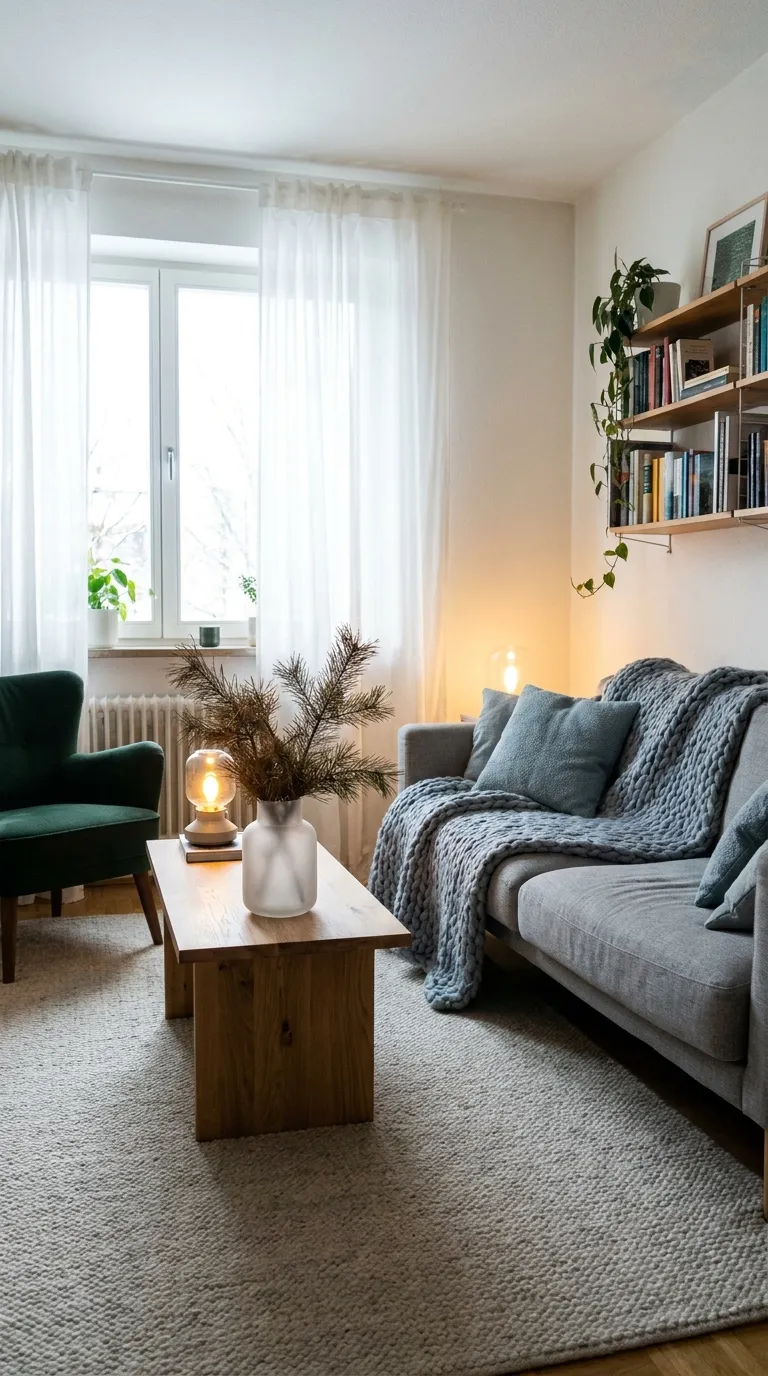
7. Frosted Blue and Gray Calm
Pale blue-gray brings a cool, snowy calm to a room, and warm fabrics keep it from feeling icy. It suits rentals with lots of daylight, or anyone who wants winter to feel quiet and open instead of heavy.
The Palette
- Main: soft gray on the sofa or bedding
- Support: frosted blue on a throw and pillow covers
- Accent: warm white on curtains and a lampshade
The Textures
- Waffle-weave cotton adds a crisp, spa-like softness
- A wool-blend throw keeps the cool tones from feeling thin
- Matte stoneware adds a quiet, chalky finish
- Frosted glass catches daylight and looks like a thin layer of ice
Key Pieces
- Blue-gray throw
- Soft gray bedding or sofa cover
- Sheer white curtains
- Frosted or clear glass vase
- Plug-in lamp with a warm bulb
Why It Works
Cool shades paired with soft white light recall a snowy day, and they make a small room feel wider. A warm bulb keeps the effect gentle instead of cold.
Keep It Balanced
Cool colors on their own can feel cold. Add one warm element to every cool zone, like a wood tray, a warm bulb, or a cream pillow.
Renter Note
Change only soft furnishings and bulbs. Nothing in this look needs paint or fixings.
8. Warm Oak and Woven Texture
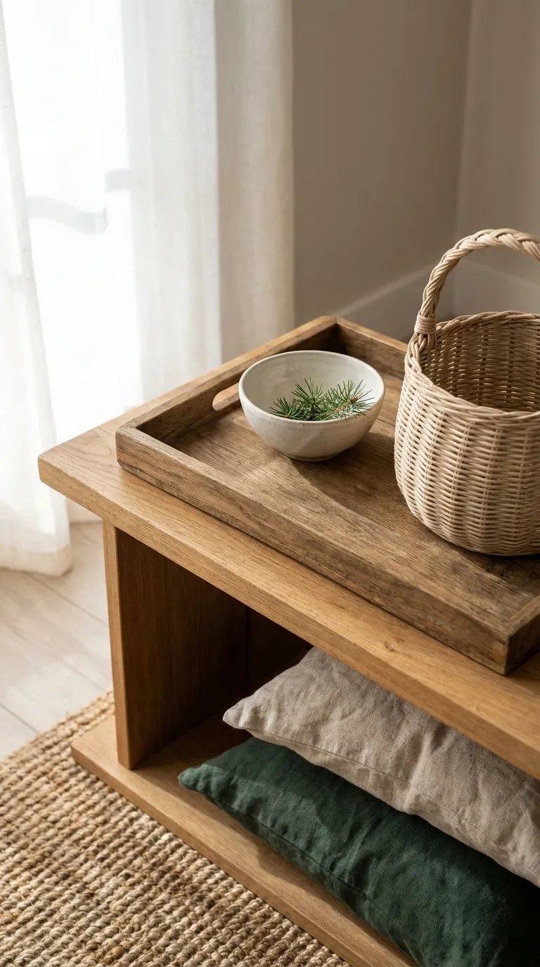
Natural materials make winter feel grounded. Warm wood and woven pieces bring the earthy look of a cabin without the bulk, and they hold up in any season. This mood suits rentals with plain furniture that needs more character.
The Palette
- Main: warm oak tones on a tray, a stool, and frames
- Support: oatmeal on a rug and a throw
- Accent: deep pine green on one plant
The Textures
- Rattan or seagrass baskets add an open, airy texture
- A jute-style or wool-blend rug gives the room a natural base
- Matte ceramic keeps the look simple
- Linen cushions soften all the hard natural edges
Key Pieces
- Wood tray for the coffee table or bed
- Woven basket for blankets
- Natural-fiber rug
- Wood stool or small bench
- Linen cushion covers
Why It Works
Natural textures bring warmth through the material itself, not through color. That means they pair with any palette and are easy to repeat from room to room.
Keep It Balanced
Warm wood and woven pieces can get busy fast. Limit woven pieces to two per zone and stick to one wood tone so the look stays calm.
Try it: build one cozy corner by picking its textures and light layers, then see if the mix stays balanced.
Renter Note
Use a rug and freestanding furniture, and lean art on a surface instead of hanging it.
9. Moody Charcoal Evenings
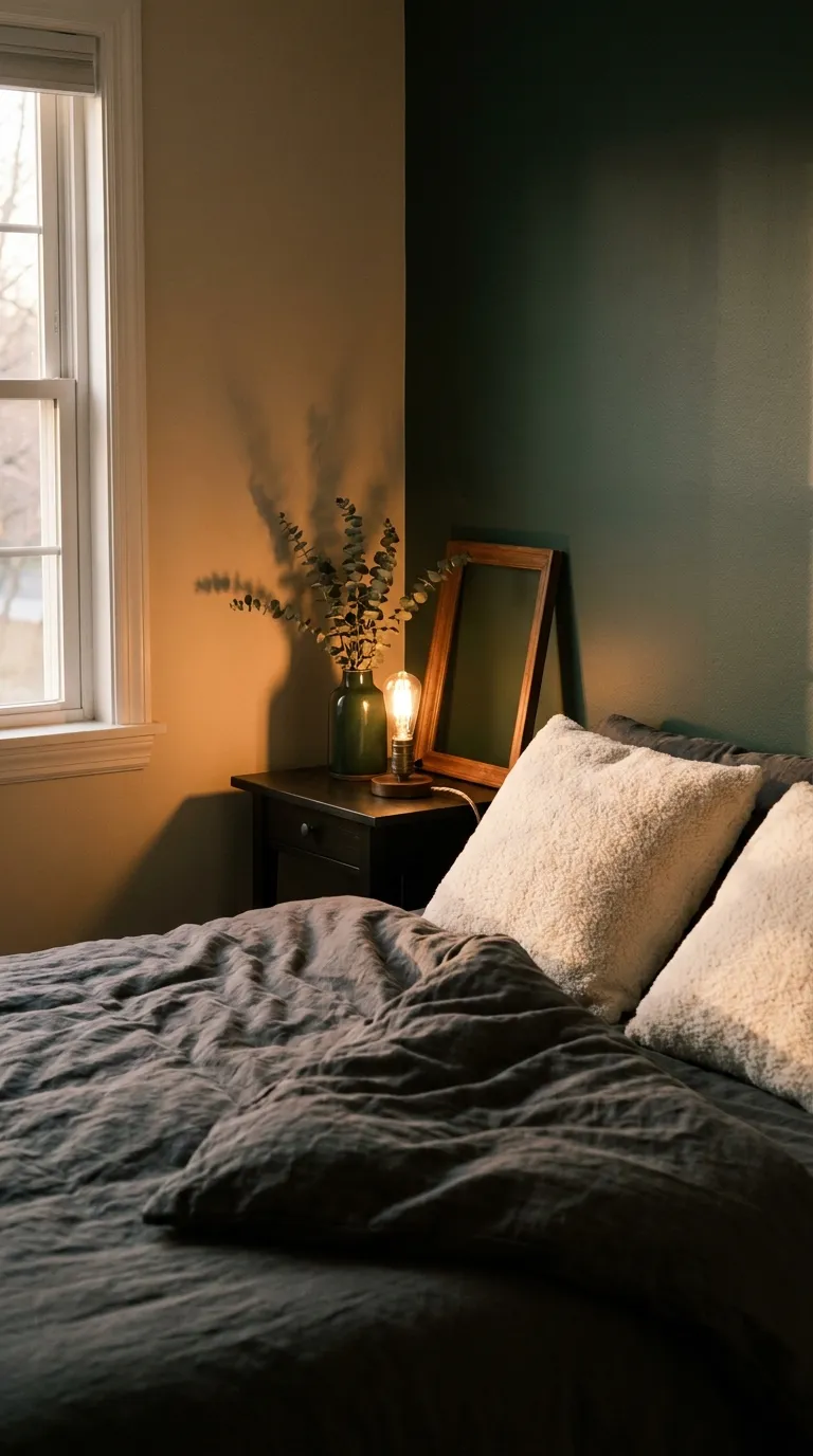
Charcoal turns a small room into a cocoon on dark nights. Used in fabric and accessories, it gives winter a dramatic, restful feel without any dark paint. It suits bedrooms and reading corners where you want the room to feel enclosed and quiet after sunset.
The Palette
- Main: soft charcoal on a duvet cover or throw
- Support: warm white on pillow covers and a lampshade
- Accent: amber light from a warm bulb
The Textures
- Velvet-feel covers soak up light and look rich in the dark
- Wool adds warmth to a color that can feel cool
- Linen in warm white keeps the mood from getting heavy
- Matte black metal in a lamp base adds a sharp, simple line
Key Pieces
- Charcoal duvet cover or throw
- Two warm white pillow covers
- Plug-in lamp with a warm bulb
- Blank frame or abstract art with soft shapes, leaned on a shelf
- Dark ceramic vase
Why It Works
Dark fabric makes a room feel enclosed and restful, and a warm light source makes the whites glow against it. The contrast gives the room depth even with very few pieces.
Keep It Balanced
Dark colors can make a small room feel smaller. Keep charcoal to textiles and a few accessories, put warm white near the window, and use a warm bulb so the shadows stay soft.
Renter Note
Use a dark duvet and curtains instead of paint, and check your lease before changing anything permanent.
10. Soft Terracotta Warmth
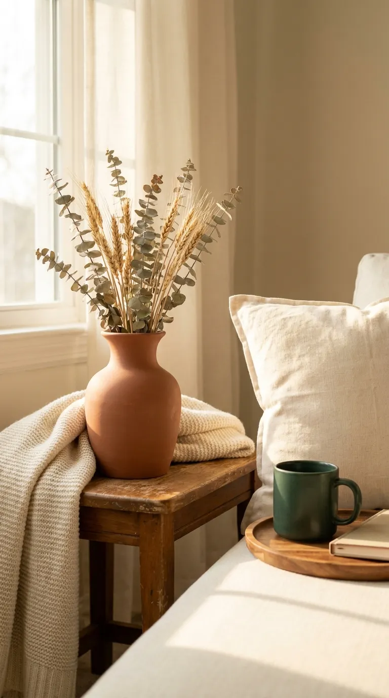
Muted terracotta brings the warmth of clay and dried earth into a season of cool light. In small doses it pairs well with cream and wood, and it suits rentals with white walls that need a warmer note.
The Palette
- Main: cream on bedding, cushions, and curtains
- Support: soft terracotta on a throw and a ceramic vase
- Accent: warm oak on a small tray
The Textures
- Matte clay ceramic adds an earthy, grounded weight
- Linen cushion covers keep the warm tones relaxed
- A wool-blend throw makes terracotta feel soft instead of flat
Key Pieces
- Terracotta throw
- Matte ceramic vase with dried stems
- Cream linen cushion covers
- Wood tray
- Plug-in lamp with a warm bulb
Why It Works
Terracotta is a warm, earthy red-brown that balances the cool light of winter days, and cream keeps it soft. The pairing feels familiar and easy to live with.
Keep It Balanced
Too much orange-brown can look heavy. Keep terracotta to two or three pieces and repeat the cream around them.
Renter Note
Stick to freestanding ceramics and textiles, and check your lease before changing any wall color.
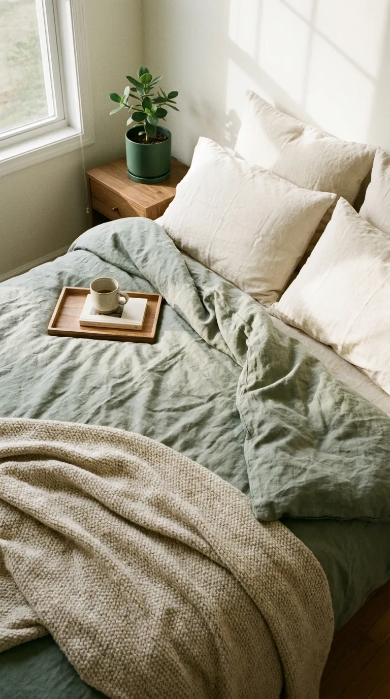
11. Sage and Cream Quiet
A soft gray-green is one of the gentlest ways to bring nature indoors in winter. Paired with cream, sage feels calm and fresh without the weight of a dark green. It suits bedrooms and anyone who wants color that stays quiet.
The Palette
- Main: cream on pillows and the bed base
- Support: sage on a duvet cover or throw
- Accent: warm oak on a bedside tray
The Textures
- Washed linen adds a relaxed, lived-in softness
- A wool-blend throw adds warmth at the foot of the bed
- Matte ceramic keeps the bedside simple
Key Pieces
- Sage linen duvet cover or throw
- Cream pillow covers
- Wood bedside tray
- Small real or faux plant (check that a plant is safe for pets before buying, if that applies to you)
- Plug-in lamp with a warm bulb
Why It Works
Sage is a muted green, so it reads almost like a soft neutral and is easier to live with than a deep green. Cream keeps the whole look light.
Keep It Balanced
Sage and cream can blur into each other. Add one darker accent, like a wood tray or a dark ceramic piece, so the look has definition.
Renter Note
Swap only bedding and a throw, so nothing needs painting. Check the care label before washing linen.
12. Minimal Holiday Neutrals
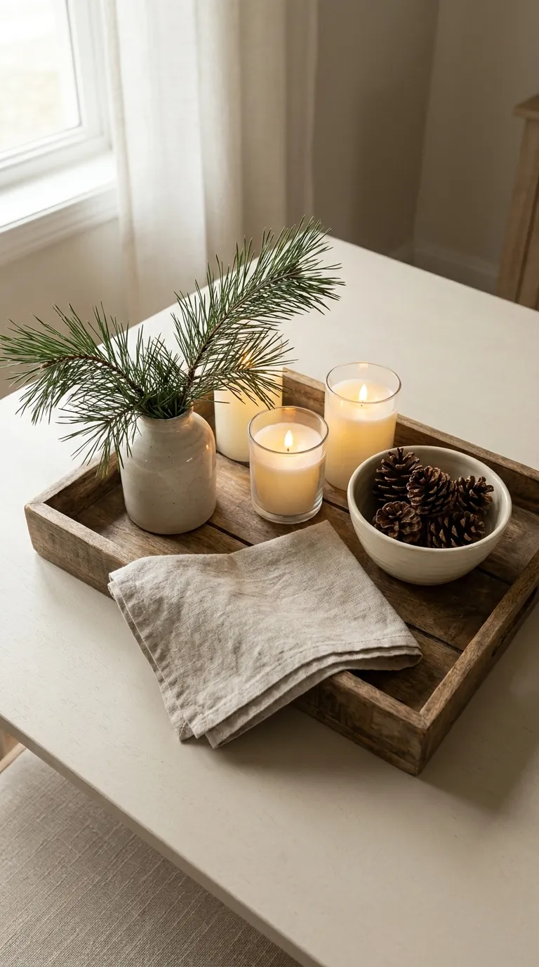
You can make a room feel seasonal without a single plastic ornament. This mood uses a few natural, neutral pieces, like a branch, a tray, and soft candles, that read as winter and pack away in one box. It suits small spaces that can’t hold much extra.
The Palette
- Main: warm white on candles, linen, and a bowl
- Support: oatmeal and natural wood on a tray and a runner
- Accent: pine green on a real or faux branch
The Textures
- Real or faux pine adds a fresh, natural line
- Linen napkins or a runner add a soft, relaxed finish
- Matte ceramic keeps the tray simple
- Clear glass adds light without adding color
Key Pieces
- Wood tray to group everything
- Pine branch in a simple vase (check that a plant is safe for pets before buying, if that applies to you)
- Flameless candles in warm white
- Linen runner or napkins
- Small ceramic bowl
Why It Works
A few natural elements signal the season clearly, so you don’t need a lot of pieces. Everything fits in one box, which matters when storage is tight.
Keep It Balanced
Seasonal pieces can pile up quickly. Stop at one surface, such as a shelf or a tray, so the look stays minimal.
Renter Note
Pack the pieces in one box when the season ends, and check your lease before using adhesive decorations on painted walls.
Quick Mood Cheat Sheet
Use this table to compare all 12 moods at a glance and pick the one that fits your room.
| Mood | Palette | Key Texture |
|---|---|---|
| Soft Oatmeal and Warm White | Warm white, oatmeal, pine green | Brushed cotton and chunky knit |
| Deep Evergreen Corner | Pine green, warm white, oatmeal | Velvet-feel and wool |
| Candlelit Amber Glow | Warm white, amber, pine green | Ribbed glass and linen |
| Chunky Knit and Wool Layers | Cream, heather gray, charcoal | Chunky knit and wool |
| Quiet Scandinavian Winter | White, light gray, pale oak | Wool and linen |
| Cranberry and Cream Accents | Cream, warm white, cranberry | Velvet-feel and wool |
| Frosted Blue and Gray Calm | Soft gray, frosted blue, warm white | Waffle-weave and wool-blend |
| Warm Oak and Woven Texture | Oak, oatmeal, pine green | Rattan, jute, and linen |
| Moody Charcoal Evenings | Charcoal, warm white, amber | Velvet-feel and wool |
| Soft Terracotta Warmth | Cream, terracotta, warm oak | Matte clay and linen |
| Sage and Cream Quiet | Cream, sage, warm oak | Washed linen and wool-blend |
| Minimal Holiday Neutrals | Warm white, oatmeal, pine green | Linen and natural pine |
How to Build Your Own Renter Winter Decor Palette
If none of the 12 moods fits exactly, you can mix your own. These steps work in any rental.
Start With One Main Color
Look at what you already own, like a sofa, a duvet, or a rug, and choose that shade as your anchor. Build your color palette outward from it, so you buy less and everything already works together.
The 60-30-10 Split
A common design guideline is to use about 60% main color, 30% support color, and 10% accent. Treat it as a starting point, not a rule. It simply stops the room from having too many equal-sized shades.
Repeat Colors Across the Room
Use each shade in at least two places, such as a pillow and a lampshade, or a throw and a vase. Repetition ties the room together, even when the pieces are small.
Use Light and Wood Tones to Warm or Cool It
A warm bulb and oak or other warm wood make a room feel warmer. Cool daylight and gray fabrics make it feel crisper. Mix both so the room feels balanced, not icy or heavy.
Test Colors at Different Times of Day
Winter light changes fast. Look at your fabrics in the morning, in the afternoon, and under your evening lamps before you commit, because a gray that looks calm at noon can look flat at night.
Palette Mistakes Worth Skipping
These are easy to make, and easy to fix.
Too Many Accents
It’s tempting to add a little of every winter shade. Pick one accent and repeat it, and the room will feel calmer right away.
Ignoring Undertones
A cool gray next to a warm cream can look like a mismatch. Hold fabrics side by side in daylight and swap one if they clash.
Matching Everything Exactly
Pieces that match perfectly can look flat. Aim for close, not identical, like two shades of cream, so the room feels collected.
Final Tips for Success
Spend on Textiles First
If you’re planning your decorating budget, put the first share into textiles and lighting, because they change how a room feels more than any other item. Add small extras only after those are in place.
Check Your Lease Before You Hang
Before you add anything to the walls, check your lease. Most of the ideas above skip wall fixings completely, which keeps your deposit safe.
Basics Worth Owning
- A knit throw
- Linen curtains on a tension rod
- Warm-toned bulbs
- Flameless candles
- A washable rug
Conclusion
Renter winter decor doesn’t need paint, drills, or a big shopping trip. It needs one mood, a short list of colors, and a few soft textures that you can pack up when the season ends.
Start with the idea that already matches your room. A throw, a lamp with a warm bulb, and one accent color are often enough to change how the room feels.
When you’re ready for more, add one layer at a time: a second texture, a lighting layer, or a seasonal branch. Each one is easy to move, and none of them put your deposit at risk.
Save this guide for the next time the evenings get dark and you want to rearrange the room.